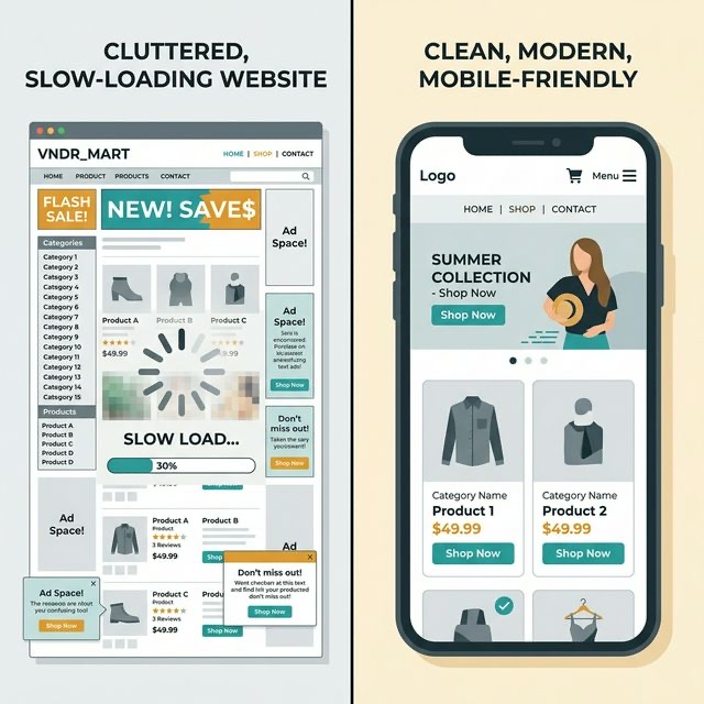
You've invested in a website. Maybe you built it yourself on Wix or Squarespace, maybe you paid someone. Either way, it exists—but is it actually working for you? Most vendor websites have at least three of these seven problems. Each one is quietly costing you bookings.
1. No Clear Call to Action
When someone lands on your homepage, they should know within five seconds what you do and how to book you. Yet most vendor websites bury their contact information three scrolls down or hide it behind a "Contact" tab that people never click.
The fix:
- Put a "Get a Quote" or "Check Availability" button above the fold—visible without scrolling
- Repeat your call to action at the bottom of every page
- Make your phone number clickable on mobile (use
tel:links) - Include your email address in plain text, not just a contact form—some people prefer email
2. Painfully Slow Loading
If your site takes more than three seconds to load, over half your visitors will leave before seeing anything. The usual culprits for vendor sites:
- Uncompressed images: That 5MB photo from your DSLR needs to be resized and compressed before uploading. Aim for under 200KB per image
- Too many plugins or widgets: Every Instagram feed embed, chat widget, and animation adds loading time
- Cheap hosting: Free or bottom-tier hosting is visibly slower. Upgrading to a decent plan (£5–10/month) makes a noticeable difference
Test your speed: Go to Google PageSpeed Insights, enter your URL, and see what comes back. Anything under 50 on mobile needs urgent attention.
3. Not Mobile-Friendly
Over 70% of your website visitors are on their phones. If your site doesn't work beautifully on mobile, you're losing the majority of potential customers.
Common mobile problems:
- Text too small to read without zooming
- Buttons too close together to tap accurately
- Images that stretch off-screen
- Menus that don't collapse into a mobile hamburger menu
- Contact forms with tiny input fields
The fix: Open your website on your phone right now. Try to navigate to your contact page and fill in your enquiry form. If it's frustrating, it's frustrating for your customers too.
💡 Pro Tip
Test your site on someone else's phone—not just yours. You know where everything is because you built it. A stranger's first impression is what matters. Ask a friend to find your menu and try to send an enquiry. Watch where they get stuck.
4. Outdated Information
Nothing kills trust faster than a website that looks abandoned. If your "latest news" section is from 2023, your menu still shows last summer's specials, or your availability calendar hasn't been updated in months, visitors will assume you're no longer trading.
The fix:
- Remove anything date-specific that you won't keep updated (or automate it)
- Update your menu seasonally—even small changes show you're active
- If you have a blog or news section, either post regularly or remove it entirely
- Check your footer—does it still say "© 2024"?
5. No Social Proof
You might have 200 five-star Google reviews, but if none of them appear on your website, visitors don't know that. Social proof is the single most persuasive element on a service-based website.
What to include:
- Three to five testimonials on your homepage (not buried on a separate page)
- Your Google review rating and a link to your profile
- Logos of venues or events you've worked at (if permitted)
- Photos of real events, not stock images
- "As featured in" press mentions, if you have them
6. Missing or Vague Pricing
This is the most debated point in vendor circles. "But every event is different!" True—but giving zero pricing information creates friction. Visitors with no idea of your price range won't enquire; they'll find someone who gives them a number.
You don't need exact prices. Try:
- "Packages start from £X" — sets expectations without committing
- "Typical wedding catering: £X–£Y per head" — gives a range
- "Minimum booking: £X" — filters out unsuitable enquiries
- A short FAQ: "How much does it cost?" with an honest, helpful answer
💡 Pro Tip
Vendors who show starting prices on their website report fewer time-wasting enquiries and more qualified leads. You're not scaring people off—you're attracting the right people.
7. No Personality
The biggest missed opportunity of all. People book vendors they like. Your website should feel like meeting you—warm, professional, human.
How to inject personality:
- Write in first person ("I started this business because..." not "The company was founded in...")
- Include a photo of yourself, not just your food
- Tell your story on your About page—why you do this, what you love about it
- Use your natural voice in your copy. If you wouldn't say it in person, don't write it on your website
- Show behind-the-scenes photos alongside polished event shots
A Quick Audit Checklist
Open your website right now and check:
- Can a visitor get a quote within two clicks?
- Does the site load in under three seconds on mobile?
- Is every piece of information current and accurate?
- Are there at least three customer testimonials visible?
- Is there some indication of pricing?
- Does the site feel like you—not a generic template?
- Would you book yourself based on what you see?
If you answered "no" to more than two of these, your website is actively losing you business. The good news? Most of these fixes take an afternoon, not a redesign. Start with the easiest one and work through the list. Every improvement is a potential booking saved.